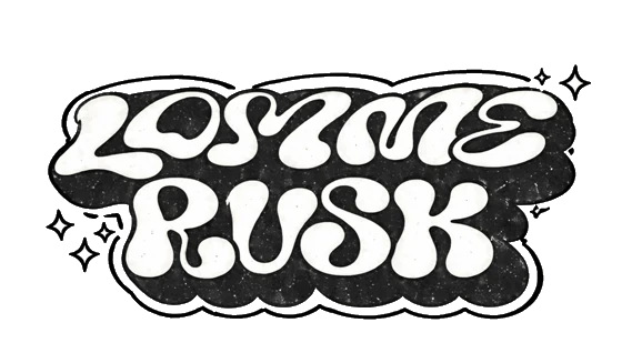
Lommerusk is the smallest of the small: what stays behind at the bottom of the pocket. A thread, a crumb, the corner of a receipt. Nobody collects it. It gathers on its own.
The brand is built the same way. A small budget and a lot of direction. Details instead of volume, good garments instead of loud ones, patient building instead of a big bang.
lom·me·rusk
noun · Norwegian
lomme (pocket) + rusk (speck, fluff)
The lint and crumbs that collect at the bottom of a pocket.
The smallest of the small: what is left.
laget av det som lå igjen i lomma.
Made from what was left in the pocket. The brand sentence.
02The principleSheet 02 / 12
Nothing to something.
N2S is not a slogan on the chest. It is the principle the rest is built on: small details, good garments, patient building. Nobody starts with something. Everything starts as almost nothing, and gets built from there.
Collections are numbered the same way: Nr. 0, Nr. 1, Nr. 2. From nothing and upward.
Ø is a Norwegian letter, and also the mathematical sign for the empty set: nothing. One stroke through a zero: 0 and 1 in the same sign. It is N2S pressed into a single symbol, which is why it can carry the brand without a word.
0+1=
03Who is behind itSheet 03 / 12
One founder, one pocket.
Lommerusk is one founder, a small budget and a lot of direction, drawn up in Oslo. That is on purpose. The name says it, the principle says it, and the whole blueprint says it: you do not need much to begin. You need a direction and the patience to build it slowly.
If the brand has a face, it is a signature: one thread that makes a loop, from nothing, something. It is kept for special editions and hangtags. On everyday clothes it would lose its value.
This page is the thinking, laid out openly, including the parts that are still changing. If something here makes you want to say something back, that is exactly what the drop list is for.
— the founder, lommerusk, Oslo
Lommerusk / Oslo 59.91°N 10.75°E
Est. 0 Nr. 0
Innhold: ingenting. Ennå.
04How we designSheet 04 / 12
Five words we design by.
Norwegian words, on purpose. They are the filter every drawing goes through.
01EkteRealHonest materials. Wash and wear are allowed to show.
03GjennomtenktConsideredEvery placement has a reason. Never a logo for the logo’s sake.
04StilleQuietTone-on-tone first. A statement is rare, and then it is stitched.
05NorskNorwegianNorwegian words, colour names and fit names. No flags.
House ruleA garment should be able to sell without a logo. The branding is the reward for whoever looks closely.
05What is whatSheet 05 / 12
Four elements, four jobs.
Most brands put the logo everywhere. Lommerusk splits the job in four, and never uses more than one or two on a single garment.
Who we are
Size
35 mm and up
Where
Website, packaging, neck label, hangtag, one or two statement pieces
How we sign
Size
30–60 mm
Where
Chest, cap, cuff, woven labels, patch, denim
How you know us
Size
10–20 mm
Where
Chest, cap, buttons, zippers, engraving. Never with text
What we stand for
Size
20–50 mm
Where
Never on the front. Neck, inside, pocket bag, hangtag, collection code
40%30%20%10%
ØLRSK + N2Slommeruskstatement
How the garments of a collection are signed, on paper. The full name is the rarest mark.
Six rules
One element per garment. Two at most, and never on the same surface.
Ø stands alone on a garment, never with text beside it.
LOMMERUSK appears on a garment only as a statement: one or two per collection.
N2S is never on the front. It is meant to be found.
Everything in one colour, tone-on-tone if possible.
Every top has the ruskelomma, also the ones with no logo.
06The drawing boardSheet 06 / 12
Logos, tried on paper.
Four directions were drawn before anything was chosen. Then the three small marks, Ø, LRSK and N2S, got twelve versions each.
Current lean
The symbol system
Ø first, text last. Everything is drawn with one line and one angle: the 51° of the Ø stroke returns in the R, the K, the N and the slash. The letters are built from the symbol, not picked from a font.
Scandinavian minimalAir. Wide spacing, normal weight, no effects. Takes up room by leaving it empty.Retro and organicSoft as lint. 1970s packaging: round, warm, a little uneven.Contemporary streetThe product code is the logo. Narrow, heavy, systematic.
The sketchbook · thirty-six small drawings
Ø, twelve symbolsTested down to 10 mm. Favourite: no. 01, gjennombrudd (breakthrough), where the stroke leaves the circle. At 10 mm, two of the others fall apart.LRSK, twelve directionsFavourite: no. 05, a custom monoline with the same stroke and the same 51° as the Ø. Stitchable down to 30 mm.N2S, the philosophy as a detailFrom a plain code to a seal around the Ø, to the equation 0 + 1 = Ø, which belongs on a hangtag, not on a garment.
Tap a sheet to enlarge it. The sheets are in Norwegian; the captions are not.
07Recognisable before the logoSheet 07 / 12
Details, not logos.
The goal is that you can tell it is lommerusk before you can read it. So the recognition sits in the garment, not on it. On paper, at least.
The ruskelomma
A hidden 6 × 8 cm pocket in the left side seam of every top, with a small woven tab that reads RUSK. The signature that is not a logo.
One angle
The 51° of the Ø stroke returns in the construction: slanted pocket openings, slanted bartacks on the cuff, a slanted edge on the hangtag.
One thread colour
All bartacks and back-stitching in oat-coloured thread, whatever the colour of the garment. Visible only up close.
Always washed
Pigment or enzyme wash on everything. No garment should look new, and none should be a clean, loud colour.
The silhouette
Boxy body, dropped shoulder, slightly cropped, long sleeves. Heavy cotton. The targets on paper: 450–480 g for hoodies, 260–280 g for tees.
The pocket joke
Inside the kangaroo pocket, a hidden pocket for the lint, labelled til rusket (for the lint). The pocket bag is printed Innhold: ingenting. Ennå. Contents: nothing. Yet.
Small things, drawn
NR. 0
Hangtag, frontOnly the Ø and the collection number.
Laget av det som lå igjen i lomma.
0 + 1 = Ø
NR. 0
Hangtag, backThe story lives here, not on the garment.
Lommerusk / OsloVask kaldt. Bruk ofte.Nr. 0
Care labelWash cold. Wear often. The last line is the brand’s voice.
Pocket bag printThe hidden joke. The shipping bag answers: Innhold: noe.
Twenty-four small marksEach one has a fixed place: a cuff, a neck, a care label, a sticker, a hangtag. Including the coordinates of Oslo.
08ColoursSheet 08 / 12
Twelve colours, from a pocket.
Named in Norwegian and taken from what you find in a pocket: asphalt, chalk, oats, tobacco, overcast. Nothing clean, nothing loud. Tap one to copy its code.
The last two were added in version 1, for a red and for the hardware.
09Words on clothesSheet 09 / 12
Few words, with meaning.
One language rule: Norwegian in lowercase for the poetic and the small words, English in capitals for the N2S statements.
Minimal
Marks and codes. Almost nothing.
lommerusk
LRSK
Ø
N2S
nr. 0
fra lomma
Poetic
Norwegian, lowercase.
laget av det som lå igjen i lomma.made from what was left in the pocket
alt starter med nesten ingenting.everything starts with almost nothing
ingenting er et godt sted å begynne.nothing is a good place to begin
små ting. lang tid.small things. a long time
bygd av rester og retning.built from leftovers and direction
Statements
English, capitals. Rare, and then stitched.
Built from nothing.
Pocket-sized ambition.
No budget. Full vision.
Self-made, slowly.
Made with less.
Quiet work.
Where the words could go
Over the shoulders. A calm arc reading NOTHING TO SOMETHING, with N2S beneath.
Up the sleeve.nothing to something running vertically from the cuff. A detail few will look for.
Stacked.ingenting / noe / noe mer: nothing, something, something more.
Three small words.rusk · lomme · nok (lint, pocket, enough). start · ekte · bygd (start, real, built). rest · stille · ro (what is left, quiet, calm).
10The drawing setSheet 10 / 12
Nr. 0, on paper.
Collection Nr. 0 is the drawing set: twelve garments, each with a fit, a colour range and exact places for the marks. It is the map of where lommerusk could go.
01 · HoodieIngenting HoodieMinimal
02 · HoodieN2S HoodieStatement
03 · Zip hoodieLomme ZipMinimal
04 · CrewneckRusk CrewneckMinimal
05 · T-shirtGrunnlag TeeMinimal
06 · T-shirtLomma TeeStatement
07 · LongsleeveMansjett LongsleeveMinimal
08 · CapØ CapSymbol
09 · BeanieRusk BeanieWordmark
10 · Baggy denimVid DenimDetail
11 · ShortsRomslig ShortsSymbol
12 · Bonus · JacketRestverdi ArbeidsjakkeWordmark
Names are Norwegian on purpose: vid is wide, romslig is roomy, grunnlag is groundwork, restverdi is what is left over.
The flats · where the marks sit
Ingenting HoodieThe groundstone. One small tone-on-tone mark on the chest. It sells on fit and wash, not on logo.N2S HoodieThe manifest, stitched and not shouted. A calm arc over the shoulders, the front carries only the Ø.Lomme ZipThe everyday one. A tiny pocket with a speck in it on the chest, LRSK discreetly under the hood.Vid DenimWide jeans. One arc seam on each back pocket, the lommebue, instead of a logo.
Orange marks show where the branding sits.
Three directions for the collection
Direction A
Clean and minimal
Undertheme: Grunnlag (groundwork)
White walls, daylight, the product alone. Tone-on-tone stitching and the Ø, no prints.
Direction B
Street and graphic
Undertheme: Restverdi (what is left)
Concrete, washed denim, a flash at night. N2S backs, relief and raw edges.
Direction C
Premium and calm
Undertheme: Stille kapital (quiet capital)
Autumn light, fjord, wool and canvas. The work jacket, knitwear and the signature logo.
Eight garments, five ways to signConcept renders made to test where the marks sit. They are not product photos, they are not the Drop 01 pieces, and nothing on this page is for sale.
Where this meets the real world
The blueprint is bigger than any one drop. Drop 01, Baklomma, arrives early 2027: heavyweight cotton, small runs, shipped from Norway. Nothing is for sale yet.
Baklomma is the back pocket. The first concept sheets for Drop 01 all start there: a pocket in a seam, a pocket with a zip, a pocket drawn as a map.
C02 Route Panel CrewneckCurved panels that map a route, cream piping, and a pocket hidden in the curved back seam.H02 Back Pocket Heavy HoodieA big pocket on the back that closes with a zip. Tonal, no drawcord, one small woven tab.J03 Back Pocket Wide DenimWide leg, uneven back pockets and a second, hidden entry on the right one. Washed grey and ecru.T04 Pocket Dust TeeA back pocket drawn as contour lines, with the coordinates of Oslo in the corner.
Skull beanies, concepts 1 to 3Three directions for the same shallow beanie: a pocket shard, a star with a tail and a curved route.
Concept sheets from October 2026. They are drawings for Drop 01, not product photos, and details may change before anything is made.
12The mullingSheet 12 / 12
Thinking out loud.
The part that does not fit on a drawing: the ideas that stuck, the ones put down, and the questions still open.
Ten ideas that build lommerusk
Ø as the main symbolNothing: where N2S starts.
The brand sentencelaget av det som lå igjen i lomma.
Tone-on-tone as a house ruleRelief before colour, always.
Norwegian colour namesAsfalt, Havre, Tobakk, Fjord and the rest.
Norwegian fit namesVID, ROMSLIG and RETT, on the denim label.
The pocket arcLommebuen: one curved seam on the back pockets, instead of a logo.
Numbered collectionsNr. 0, Nr. 1 … from nothing and up.
The curved N2S backThe hero garment, the one that carries the story.
Unexpected placesHem, sleeve, cuff.
A pocket for the lintA hidden pocket inside the kangaroo pocket, labelled til rusket.
Tried, and put down for now
The soft, retro wordmarkWarm, but it loses precision when it gets small.
The heavy, condensed LRSKStrong as a patch or a tab. A bit too loud for a chest.
Two of the twelve Ø symbolsThe broken ring and the stitched ring. At 10 mm they fall apart.
The handwritten signature, every dayIt would lose its value on everyday clothes. It is kept for special editions and hangtags.
The work jacketSaved for a calmer collection, Stille kapital.
Still open
Capitals or lowercase?LOMMERUSK drawn with the Ø’s own line, sharper and more systematic, or the soft lowercase lommerusk. Both exist on paper, and the latest sheets lean towards capitals.
How small can it be stitched?Tests on paper: the Ø at 2–3 cm and the wordmark at 4.5 cm, tone-on-tone.
Who gets which mark?On paper: Ø on most garments, LRSK as the signature, N2S hidden, LOMMERUSK on a single statement piece.
Next, as drawn in the October plan
Pick the logo mixConfirm the Ø, the wordmark and LRSK, then have a designer draw and vectorise them.
Stitch testsAsk for strike-offs of the Ø and the wordmark at real size.
A first sampleOne hoodie, to check weight, wash and fit.
Check the marksN2S, LRSK and Ø with the trademark office, before production.
ContentPhotograph the samples and make the launch films.
Drop 01Early 2027
Follow it from nothing.
Baklomma, Drop 01, is on its way. Small runs, shipped from Norway. Leave your email and you will hear before anyone else.